As you may have seen on our social media before the festive break, we shared the exciting news that we are launching a new brand identity for our RailSmart suite of products. The evolved branding is cleaner and sleeker in its design, to keep in line with 3Squared’s drive to keep up with the evolving demands of the rail industry for seamless, efficient, and easy to use tools and technologies.
To capture this change, we recently spoke with Patrick Handley, UX/UI and Graphic Designer at 3Squared, on what the thinking process behind this change was, and the intricacies behind the new branding:
What was 3Squared’s main motivation for evolving the RailSmart brand?
In a nutshell, we wanted to make the RailSmart brand more relatable, whilst giving it a simple, fresh, and contemporary feel. We wanted to make our products more attractive to both new and existing customers, within the transportation sector and potentially in other markets too. This aligns with the overall aim of helping 3Squared continue to grow and to enhance our reputation within the industry as an innovative, forward-thinking technology company.
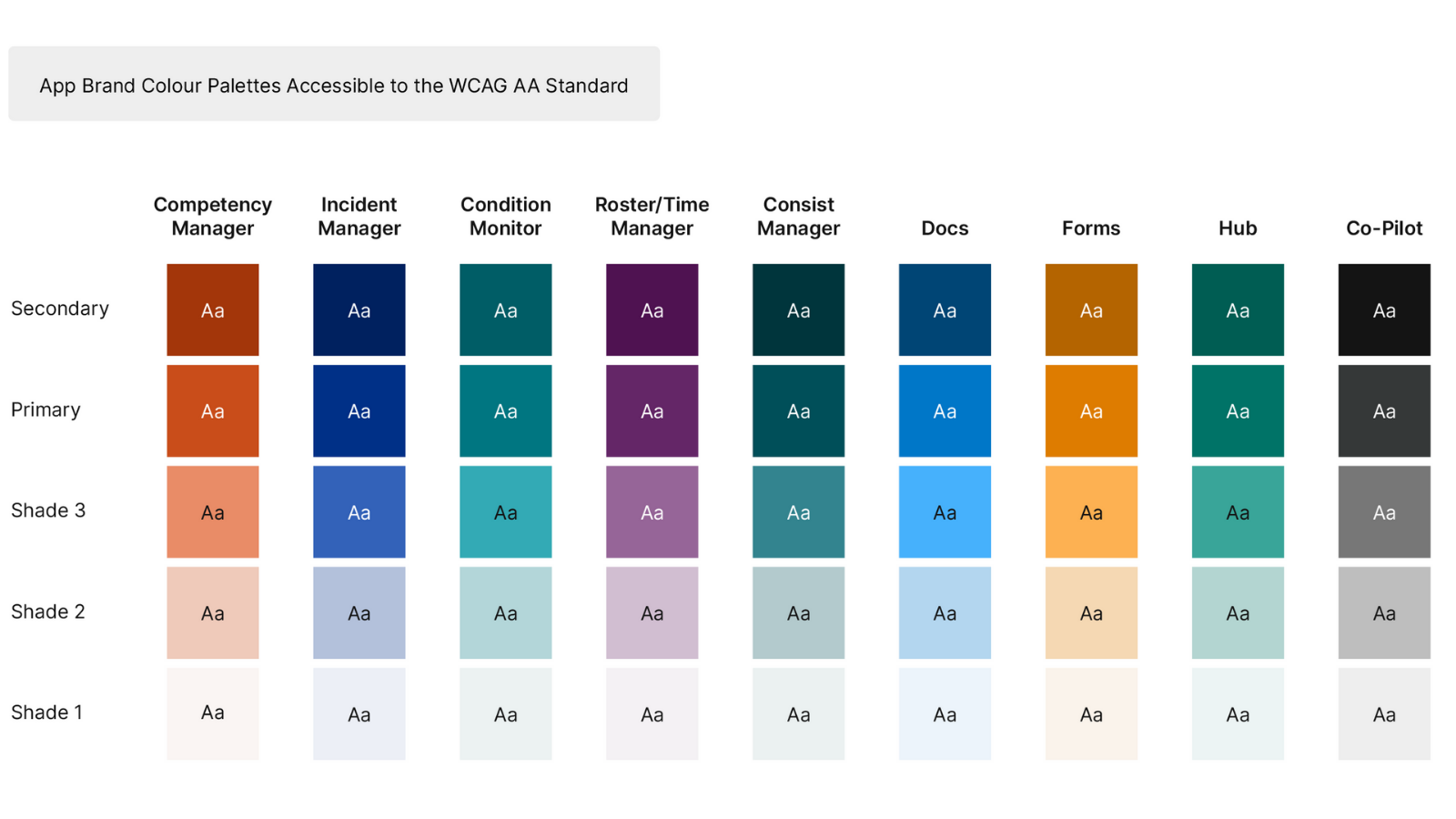
Alongside the design evolution, we have also begun a conscious drive to design our web and mobile applications with accessibility and ease of use in mind, based on Web Content Accessibility Guidelines (WCAG). Our inclusive design approach is led by collaboration; we consult with our clients to understand their teams’ needs, and configure the interface appropriately, always in line with current best design practices.
What was the creative process behind the new brand assets?
The brief was always for an evolution rather than a revolution. The process for creating the new brand assets, such as the logos and colour palettes, was simply to assess what we already had and build on it. We aimed to simplify wherever possible and made sure that the new assets aligned with current trends and best practices, whilst always keeping in mind our drive towards accessibility, relatability, and consistency.
With regards to creating the new app names, the mantra here was to take a ‘Does what it says on the tin’ approach. Coming up with the new names was a complex process which involved lots of meetings and to-ing and fro-ing with different ideas. However, we had been aware for some time that new, existing, and potential RailSmart customers were getting lost in all the acronyms we have previously used to refer to our different apps. Therefore, creating a set of consistent, easy to understand app names was one of the key ingredients of the brand evolution and crucial in determining its success.
![]()
![]()
Was it a collaborative process or did you work to a brief with input from the the other designers and wider 3Squared team?
I was responsible for creating the new assets, such as the logos, App Brand Colour Palettes, and decorative aspects for the new RailSmart brand, whilst working from a well-defined brief. I received continuous feedback and input throughout the process from other members of the Service Design Team, our directors Tim Jones and James Fox, and colleagues from the wider 3Squared team. This was invaluable in enabling me to create a body of work that not only fulfils the brief, but one that will also hopefully stand the test of time.
Coming up with the new app names was more of a collaborative process and involved input from numerous people from different teams across 3Squared, including the directors. This was arguably the most difficult aspect of this work, requiring many meetings and ideas sessions before we came to a set of suitable names that we were all happy with, fulfilling the ‘does what it says on the tin’ aspect of the brief.

How have you married the new assets with the legacy assets? Is there a common brand link?
The initial brief was always to evolve rather than rebrand, as we didn’t want to risk alienating or causing unnecessary upheaval for existing customers. Whilst there is no marriage of the old and new brand assets as such, the evolution process is very clear when you compare the new assets against the old ones.
How do you think the new look will speak to current and untapped audiences?
The new designs provide a modern, fresh, simple look and feel, as well as being more relatable in our brand voice.
Are there any new tactics or measures you will be creating to evolve the brand further?
From here, it is very much a process of implementation and in truth it may take some time before we can boast a full implementation of the new brand assets and accessibility features across all our apps. However, we are hoping to release a new website in the next few months, which will serve as the launch pad for our new RailSmart brand to the outside world.
Finally, what do you hope the new brand identity will achieve?
Ultimately, I hope that the new, relatable brand identity will help us to attract new customers for our industry leading software and support 3Squared’s continued growth. I also hope that the new brand assets will help to clarify our product offerings for new and existing customers, whilst also standing the test of time in taking the RailSmart brand forward over the coming years.
James Fox, Commercial Director and Co-Founder at 3Squared, commented on what the design evolution means for the business: “We are excited to evolve our RailSmart brand in line with the changing needs of our customers. Well done to Patrick and the team for bringing our vision to life, and we hope that the new accessible, modern designs make an impact across the industry and to our customers.”
Thanks to Patrick for the detailed insight into the new RailSmart design assets. Find out more information about RailSmart and its diverse range of benefits, here.